 SOWERLanding page concepts · Oct 2026
Three directions for sowingtruth.org
Each concept uses the app’s real content, screens and hand-drawn illustrations, and is written for launch: no invented user numbers, reviews or testimonials. They differ in idea, typography and motion. Open each one full-screen, scroll slowly and try the interactive parts — most of the character is in the movement.
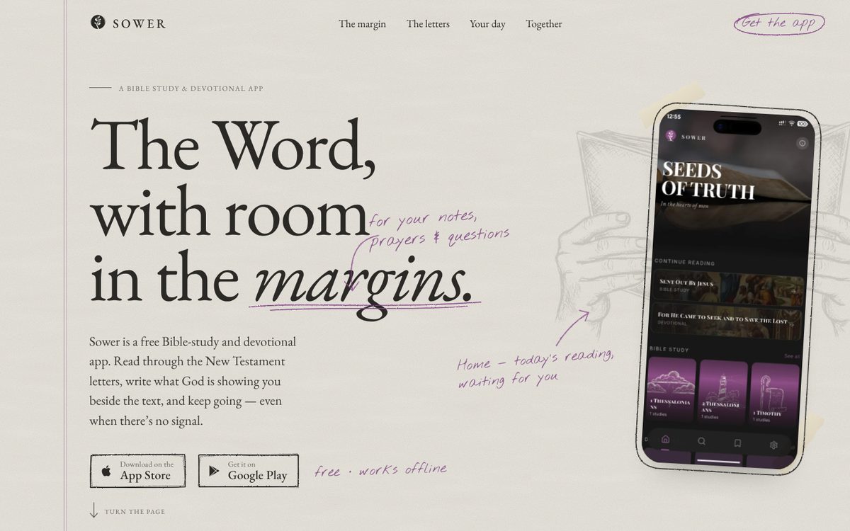
Margins
The site is a study notebook. The printed Word sits in EB Garamond; your notes are written in pencil, live, as you scroll. The app’s own sketch illustrations become graphite drawings on paper.
- Mood
- Premium, quiet, handwritten, personal
- Type
- EB Garamond (real small caps) · Nothing You Could Do
- Palette
- Signature
- Pencil that writes the notes; drag-to-highlight James 1 with margin notes; pick a coloured pencil to re-ink the page
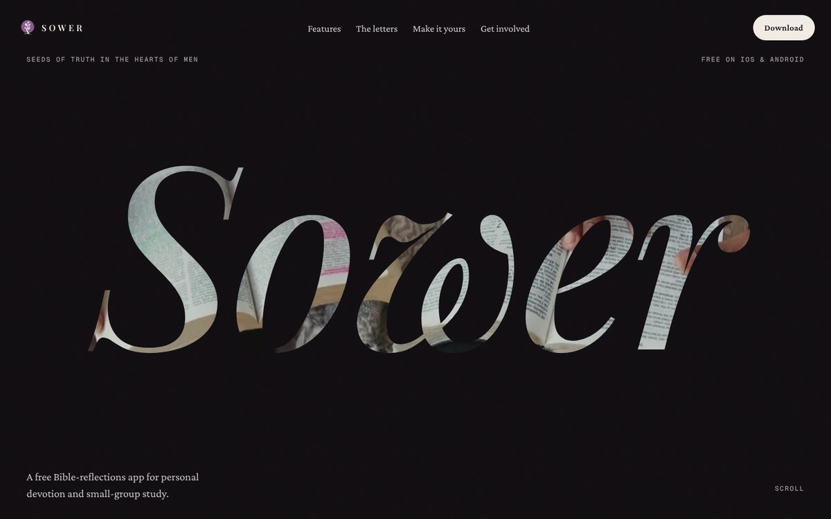
Vesper
Same DNA as today’s site — dark, plum, Playfair, the reading video, the seed cursor — rebuilt as a cinematic sequence, with the fake stats and testimonials replaced by things you can try.
- Mood
- Cinematic, reverent, evening light
- Type
- Playfair Display · Crimson Pro · Geist Mono
- Palette
- Signature
- Video seen through the wordmark, zooming through the “o”; pinned phone tour; hold-to-complete, airplane mode and accent colours you can use
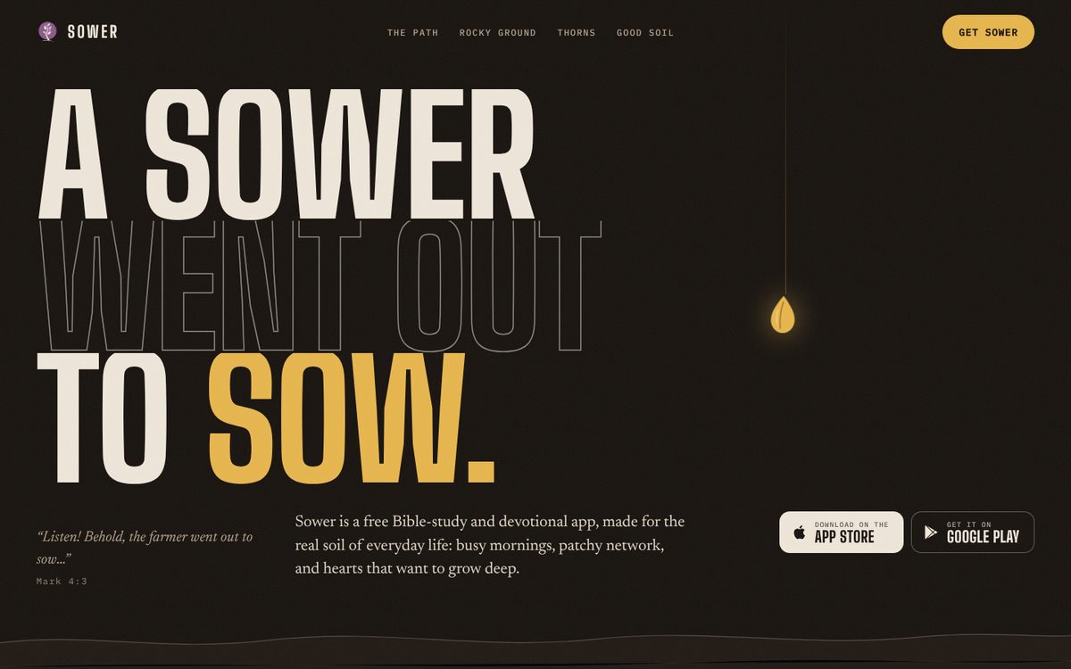
Four Soils
The page is the parable. A golden seed follows you down through the path, rocky ground and thorns — each one a real obstacle to daily Bible reading, each answered by a feature — until it lands in good soil and the Sower tree grows.
- Mood
- Bold, earthy, local, evangelistic
- Type
- Big Shoulders Display · Newsreader · IBM Plex Mono
- Palette
- Signature
- Scroll as descent through soil strata; birds, roots and thorns react; “30 · 60 · 100” as the only numbers
Shared foundations
- Real app screens, illustrations (all 21 letters), copy and the 12 accent colours from the Sower repo
- Scripture from the World English Bible (public domain)
- Fonts self-hosted (OFL); GSAP + Lenis vendored: opens offline
- Respects reduced motion; keyboard focus visible; mobile layouts
To confirm before build
- App Store / Google Play links (buttons are placeholders)
- That studies cover all 21 letters, Romans – Jude
- “Free” and offline claims as worded; feedback email address
- Concept C’s Zambia framing (towns, “bundle”, cell groups)
- The highlight and offline phone screens in B are HTML recreations; swap for real captures
How to review
Use the A / B / C switcher in the bottom-right of any concept. Try a phone-width window too. In A, drag across the James passage and click a pencil; in B, hold the “Hold” button and try a colour.